The original of the image featured on the masthead is nearly 15 feet wide! Go here to see a high resolution version of Vrubel’s masterpiece, one of his many hallucinatory illustrations of Lermontov’s poem The Demon.
As the twentieth century appeared on the Russian horizon, Symbolism took on the most compelling form it would ever assume. Soon it would metamorphose into modernism . One can see this shift as if in stop-motion animation in the early works of Kandinsky and Mondrian.
During the Cold War, the same tacit, unofficial but utter censorship of Russian art in the west, which kept Tchaikovsky out of concert halls, left the masterpieces of Russian Symbolism undiscovered, even as the Pre-Raphaelites made a triumphant return, from the first retrospectives that introduced them to an audience just discovering Tolkein—to their current position on calendars and refrigerator magnets.
Mikhail Vrubel (1856-1910), son of Danish and Polish parents, studied law in St. Petersburg before enrolling in the city’s School of Fine Arts at age twenty-four. He spent five years restoring the frescoes of the Church of Saint Cyril in Kiev (that influenced his later hieratic, mystical style) , and finally settled in Moscow. His greatest work, of which the above is an example, was a series of paintings inspired by Lermontov’s 1839 poem The Demon. (This high romantic poem of doomed love is not very long, but has so far not been appealingly translated into English).
Vrubel’s obsessive engagement with the story is out of all proportion to the merits of the text. For fifteen years he painted the demon over and over, as a despairing androgyne, who flies and finally falls in a chaos of deconstructed gender and broken feathers. Vrubel went mad in 1902, blind in 1906, and died in 1910. The Russian Constructivist Gabo called Vrubel “the Russian Cézanne.” His dense, impressionistic images, with mosaic-like impasto, seem to swirl with menacing illumination.

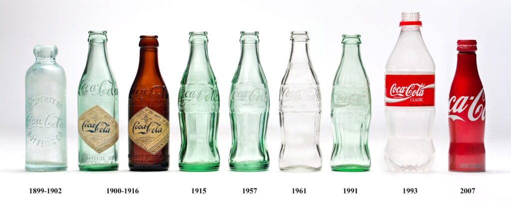
Since in the present issue Th. Metzger has provided us with an alternate history account of Coca Cola, we cannot resist adding a note about the classic Coca Cola bottle. Patented in 1915, it instantly became an iconic, globally recognized, design. The three to its left show what soda bottles in general looked like before.
The ribbed sides of the 1915 version (modeled on the a cocoa bean pod—the cola bean pod is just lumpy) combined with the feminine shape of the bottle (which earned it the nick-names “hobble skirt” and “Mae West” bottle,) gave it a look that was faintly suggestive of Art Nouveau—yet absolutely modern. (The hobble skirt, introduced by Poiret, was inspired byTurkish trousers and the ballet Schéhérazade. Ankle-length, it narrows at the ankle, making walking a somewhat restricted business. The 1915 bottle approximates its outline.)
A mint condition embossed-script Coke bottle with the 1915 patent statement can be had for about $25 on Ebay. They were mass produced, and there are still so many out there they aren’t worth much. Still, it’s a beautiful, historically significant , industrial design, and a most impressive addition to one’s wunderkammer.